
“I’ve always been looking for a design that, the moment someone on the other side of the world sees it, makes them feel, ‘This is unmistakably Chinese’ — a design that conveys a sense of modernity rooted in a long history and rich cultural traditions.”
— Petter T. Moshus
Director of Design and Look, Lillehammer 1994 Winter Olympics
International Jury Member, Beijing 2008 Olympic Emblem Competition
English reconstruction based on Chinese press reports, 2003; not a verified verbatim English transcript. Source ↗
I came across these words only after we had completed our own logo.
What struck me was how closely they echoed a question I had been asking throughout our design journey.
01 / THE QUESTION
When we began creating the visual identity of China Beyond Travel, I found myself returning to one deceptively simple question:
What could truly represent China?
A traditional Chinese roof?
A classical garden?
A landscape of mountains and rivers?
Or perhaps an ancient Chinese seal?
Each seemed to offer a different answer. And yet, none felt quite complete.
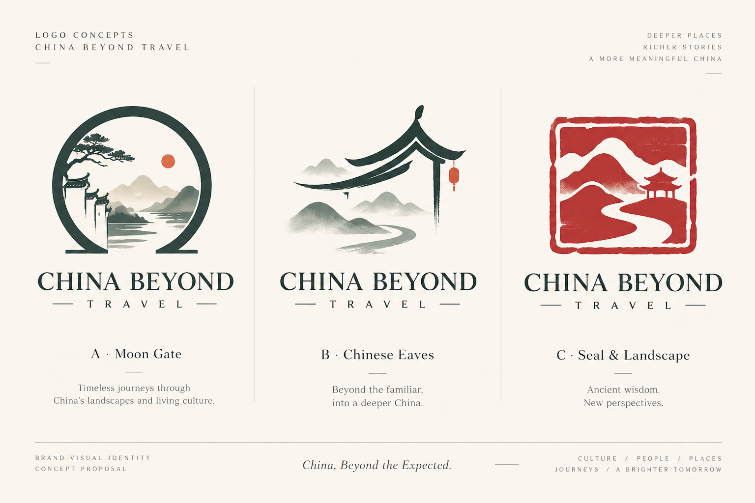
Our first explorations led us in three directions. The first drew inspiration from traditional Chinese gardens, with a moon gate opening onto a landscape beyond. The second combined the graceful curves of traditional architecture with distant mountains and flowing water. The third took inspiration from Chinese seal carving, bringing together a landscape and the visual language of an ancient art form.
All three had something compelling about them. But I kept coming back to the second.
02 / THE ATTRACTION
Not because of the architecture. It was the landscape beneath it that caught my attention.
There was something beautiful about those soft, almost disappearing mountains, and the quiet line of a river winding into the distance. It reminded me of traditional Chinese ink painting.
A few simple brushstrokes could suggest an entire world. The mountains didn’t need to be fully drawn. The river didn’t need a clearly defined destination. What remained unpainted was just as important as what was visible.
There was a sense of openness, tranquility, and endless possibility. That was the feeling I wanted for China Beyond Travel. So we decided to explore it further.
03 / THE CHALLENGE
The right feeling. Not yet the right form.
We experimented with winding rivers, distant peaks, fading ink, and generous negative space. The results were beautiful in their own way. But the more we developed the idea, the more we began to recognize a problem.
A beautiful painting doesn’t necessarily make a good logo.
Traditional ink painting derives much of its beauty from subtle tonal variations, delicate textures, and the way individual brushstrokes dissolve into empty space.
A logo, however, has a different job. It needs to remain recognizable when reduced to a tiny social media profile picture. It must work in print and on screens, in color and in monochrome, at both large and small scales.
The finer details that made our landscapes feel so atmospheric were also the details most likely to disappear when the image was reduced. And as we simplified the landscape, something of its original character was lost.
We had found the right feeling. But not yet the right form. So we returned to our earlier concepts.
04 / THE REFINEMENT
Back to the seal
This time, we looked again at the third direction: the Chinese seal.
The more we explored it, the more we appreciated the quiet strength of Chinese seal carving.
For centuries, seals have carried names, identities, artistic expression, and personal meaning. Through the interplay of carved forms and empty space, even a small impression can hold remarkable depth.
We didn’t want to recreate an antique seal. Instead, we wanted to draw on its spirit: simplicity, balance, and the expressive power of a few carefully chosen forms.
Gradually, our design became simpler.
Mountains. Water. A human figure. Nothing more.
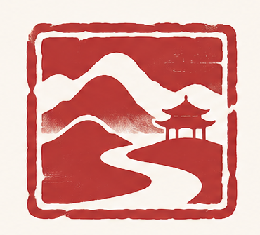 Early seal-inspired concept
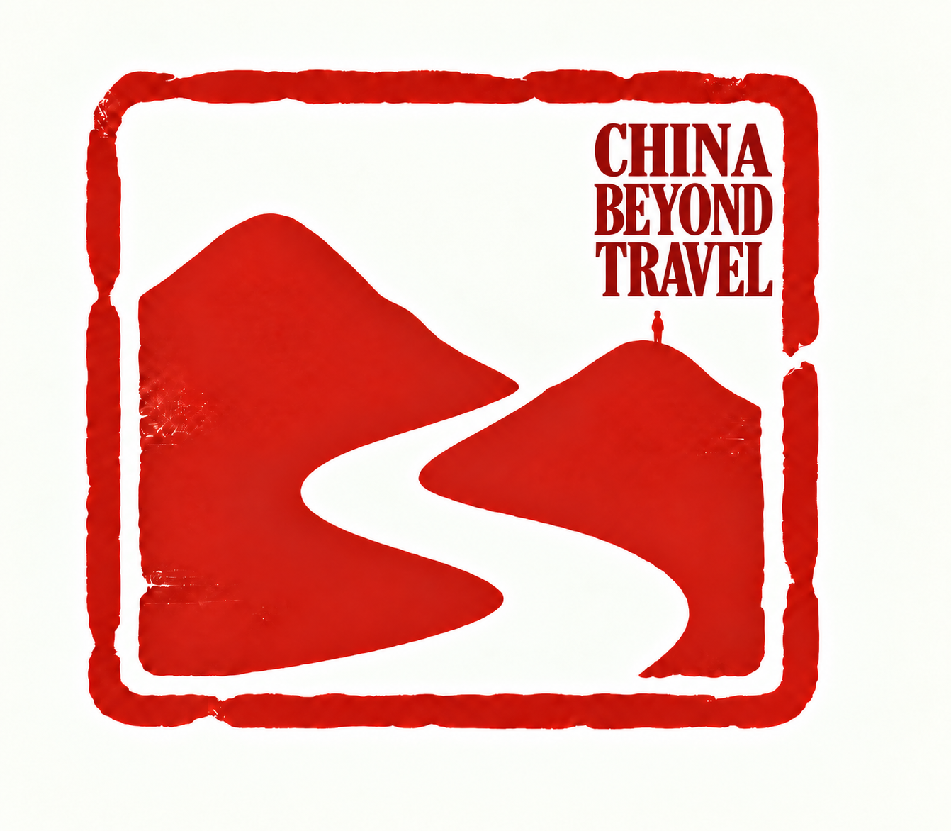 Approved emblem
05 / THE MEANING
The relationship between nature and us
In their relationship, I saw something that resonated with a much older idea in Chinese thought: the connection between Heaven, Earth, and humanity.
The mountains and flowing water evoke the natural world. The small human figure suggests our place within it.
Together, they remind me of the harmony between humanity and nature, and of the Daoist appreciation for simplicity, stillness, and living in accordance with the natural course of things.
The result wasn’t intended to illustrate a philosophy literally. It was simply a way to express something we believed.
That a journey is not only about the places we see. It is also about how we find ourselves in relation to the world around us.
06 / THE DISCOVERY
No single symbol can define a country.
And somewhere along this design journey, another thought became increasingly clear.
We had started by asking what single symbol could represent China. But perhaps that had been the wrong question all along.
How could one image capture a country shaped by millennia of history, philosophy, art, and living traditions?
A country of extraordinary landscapes, countless local cultures, vibrant cities, and more than a billion individual lives?
It couldn’t. And perhaps it shouldn’t.
No single symbol can represent all of China. Just as no single perspective can define it.
That realization became more than a design decision. It became the philosophy behind China Beyond Travel.
BRAND PHILOSOPHYWe don't define China for our travelers. We help them discover it for themselves.
Because the China you discover may be different from the China someone else sees.
Your interests may lead you to an ancient temple, a contemporary city, a mountain village, or a conversation with someone whose life is entirely different from your own.
And that is precisely what makes travel meaningful.
Just as the winding river in our logo leads the eye toward the horizon, our journeys invite you to look beyond the view — and discover your own perspective on China.
CHINA BEYOND TRAVELFind Your Own China.